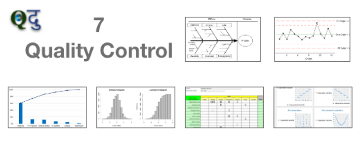
Introduction of 7 QC tools: 7 QC tools comprised of simple graphical and statistical techniques were helpful in solving Critical to Quality (CTQ's) related issues. These Quality tools were often referred to as 'Seven QC tools of Quality'.
7 QC tools are:
1. Cause & Effect diagram:
The cause & Effect diagram is also known as the 'Ishikawa diagram' or 'Fishbone diagram'. This tool was introduced by Kaoru Ishikawa. The Cause and Effect diagram helps us to identify the various causes (factors) leading to an effect (Problem).
The main purpose of the use of this diagram is: To understand the root cause behind the problem statement. To identify the source of variation the causes are usually grouped into these categories (According to the team's understanding):
You Can Use 6 M for the Fishbone diagram: 1. Man 2. Machine 3. Material 4. Method 5. Measurement and 6. Mother Nature or environmental.
You can also use 5 P: 1. People 2. Process 3. Product 4. Policy 5. Procedure
2. Histogram:
The Histogram was introduced by Karl Pearson. The main purpose of the use is to plot the shapes of distribution and compare them with the specification.
How to use Histogram: Prepare separately, the stratified histogram for each of the 4M's and examine the relationship between the shapes of the distributions and the specifications. Use at least 30 values, preferably 100 values for mass manufacturers. more in data, more in conclusion.
3. Pareto Chart:
Pareto Chart was introduced by Vilfredo Pareto. The Pareto chart is revolved around the 80-20 rules, Which underline that in any process 80% of the problems is just caused by 20% of a few major factor which is referred to as vital few, whereas remaining 20% of the problem is caused by 80% of many minor factors which is referred as trivial many.
The purpose is to use the Pareto chart to identify and prioritize the problem, Analysing symptoms, and prove the effectiveness of the remedy.
4. Check sheet:
The purpose of the use of the checklist is to list down the Important checkpoints or events in a tabular/ Metrics format and keep on updating or marking the status of their occurrence which helps in understanding the progress, defect pattern and even cause for the defect.
5. Flow Chart:
The flow chart is a type of diagram which represents a workflow or process through the boxes.
Purpose of flow Chart:
A visual illustration of the sequence of operations required to complete a task.
Schematic drawing of the process to measure the defects and improve.
Identify the potential weakness in the process is made visual.
Picture of the process as it should be.
What are the benefits of the flow chart
Identifying the process difficulty very easily
Understand the process
Identify the duplicate effort and non-value added steps
Clarify working relationships between people and the organization
6. Scatter Diagram:
A Scatter diagram is also called a scatter plot. Both are basically a statistical tool that depicts the dependent variable on Y-Axis and the independent variable on the X-Axis plot as a dot on their common intersection points.
Purpose of the scatter diagram: To identify the correlation between two variables (X and Y). Joining these dots can highlight any existing relationship among these variables or an equation in format Y=F(X)+C. C is an arbitrary constant.
The relationship can be linear, curvilinear, Exponential, logarithmic, quadratic, or polynomial. The stronger the correlation, the Stronger the relationship will hold true.
7. Control Chart:
The control chart is also known as the Shewhart chart. The control chart was introduced by Walter A. Shewhart. The Control chart is a basic statistical chart that helps in determining if any industrial process or products are within the control limit and capable to deliver or meet the customer's defined specification limit.
Why we use a control chart?
1. Predict process out of control or out of specification limits.
2. Distinguish between specific, identifiable causes of variations.
3. Can be used for SPC (Statistical Process Control).


